Empowering entrepreneurs to build sleek, beautifully designed forms.
Beginning of 2022 I worked with a small team—one product manager, and four software engineers—to produce and revamp a platform for building customized forms. My objective was to radically improve the form creation process in order to have users build faster but also allow them to customize based on their needs.
ROLE
UX/UI Designer
TEAM
Product Manager
Software Engineers
Motion Designer
RESPONSIBILITES
User Interface
User Experience
Visual Design
ROLE
UX/UI Designer
TEAM
Product Manager
Software Engineers
Motion Designer
RESPONSIBILITES
User Interface
User Experience
Visual Design
ROLE
UX/UI Designer
TEAM
Product Manager
Software Engineers
Motion Designer
RESPONSIBILITES
Interface
Experience
Visual Design

Revamping the experience
Revamping the experience
Revamping the experience
I was invited to work on this project after their current designer left and the project was already in development but had been halted. As a new member of the team, I participated in numerous brainstorming sessions with the core team, I began to develop a good understanding of how the product works, what's important going forward, targeted customers, and more.
I was invited to work on this project after their current designer left and the project was already in development but had been halted. As a new member of the team, I participated in numerous brainstorming sessions with the core team, I began to develop a good understanding of how the product works, what's important going forward, targeted customers, and more.
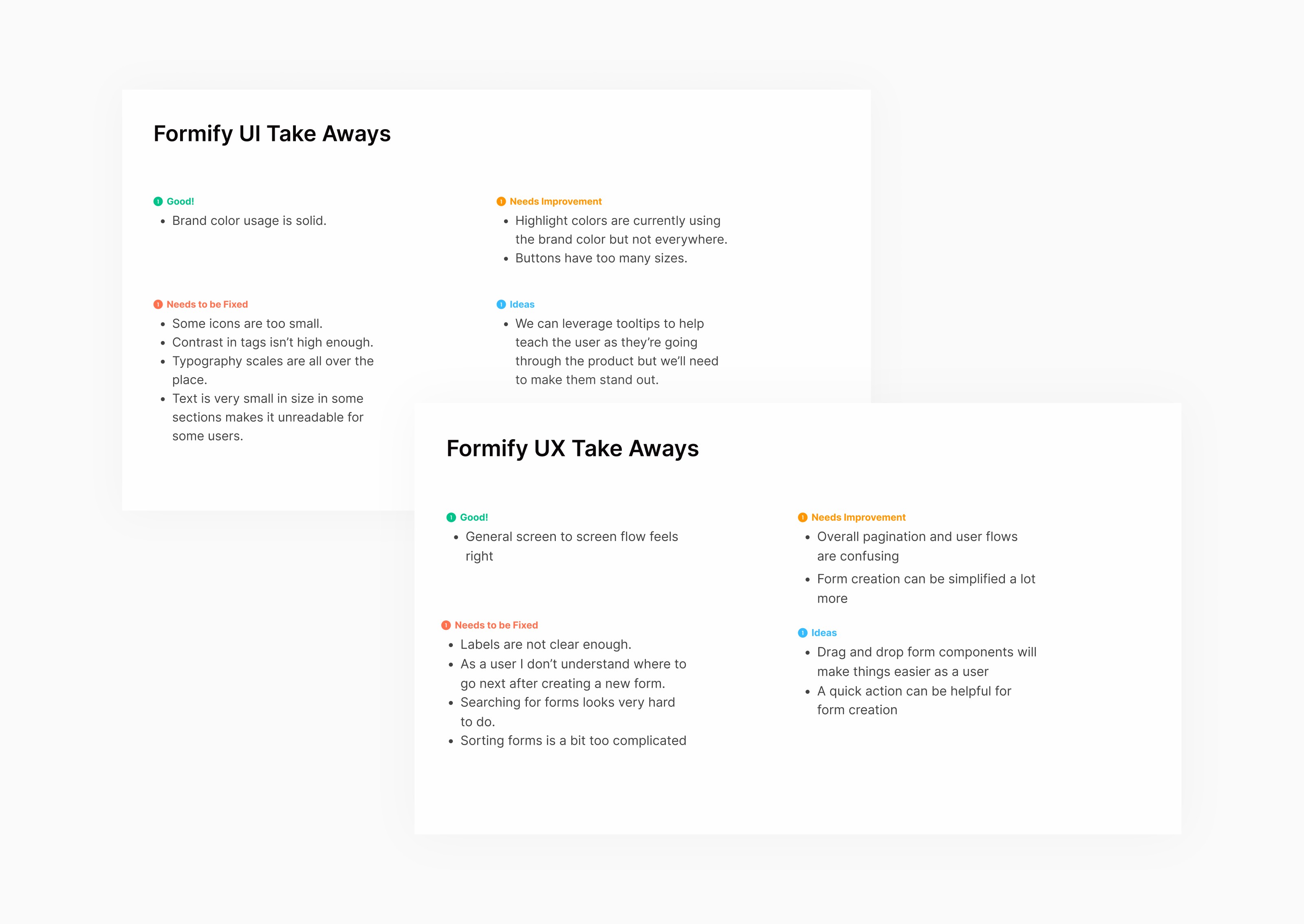
Starting a new project is always exciting but I was anxious going forward with this project as I knew it was going to be challenging especially when part of the design is already in place. How I maneuvered through this would be crucial to the project's success. Started by conducting a UX audit of the current designs to identify areas for improvement. It was challenging to evaluate another designer's work as there was little to no context on their design decisions.
Starting a new project is always exciting but I was anxious going forward with this project as I knew it was going to be challenging especially when part of the design is already in place. How I maneuvered through this would be crucial to the project's success. Started by conducting a UX audit of the current designs to identify areas for improvement. It was challenging to evaluate another designer's work as there was little to no context on their design decisions.
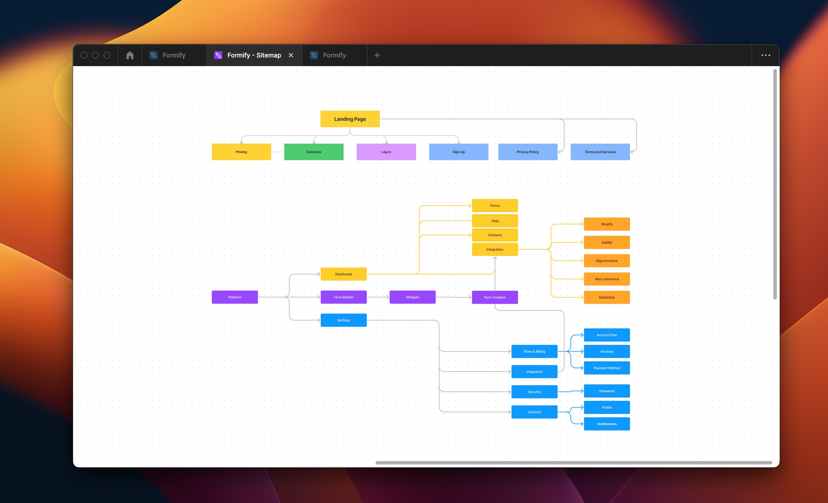
However, changes needed to be made so I created a list of some UX mistakes I found and potential improvements that needed to be made, including changes to the information architecture (IA) because it was pretty disorganized.
However, changes needed to be made so I created a list of some UX mistakes I found and potential improvements that needed to be made, including changes to the information architecture (IA) because it was pretty disorganized.
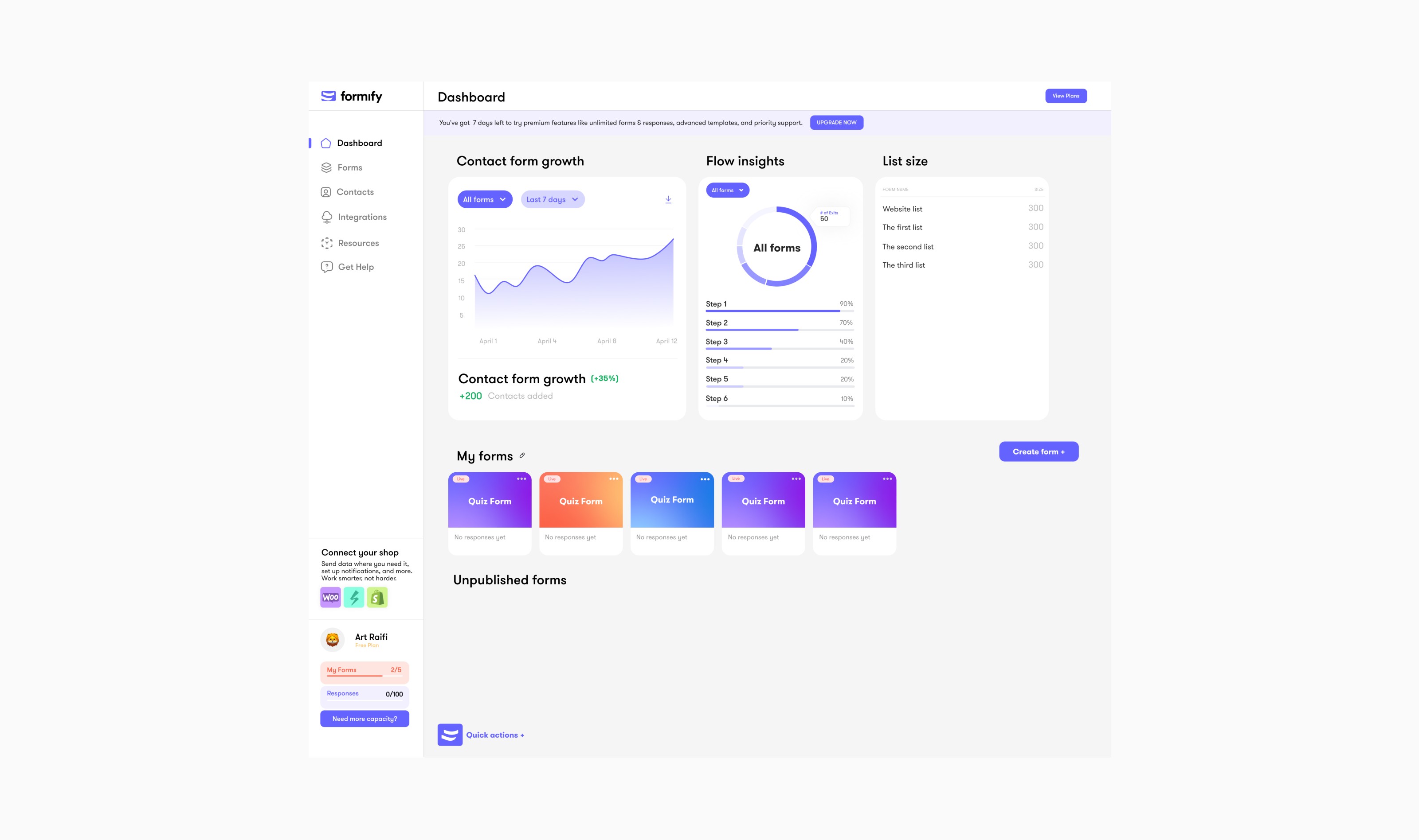
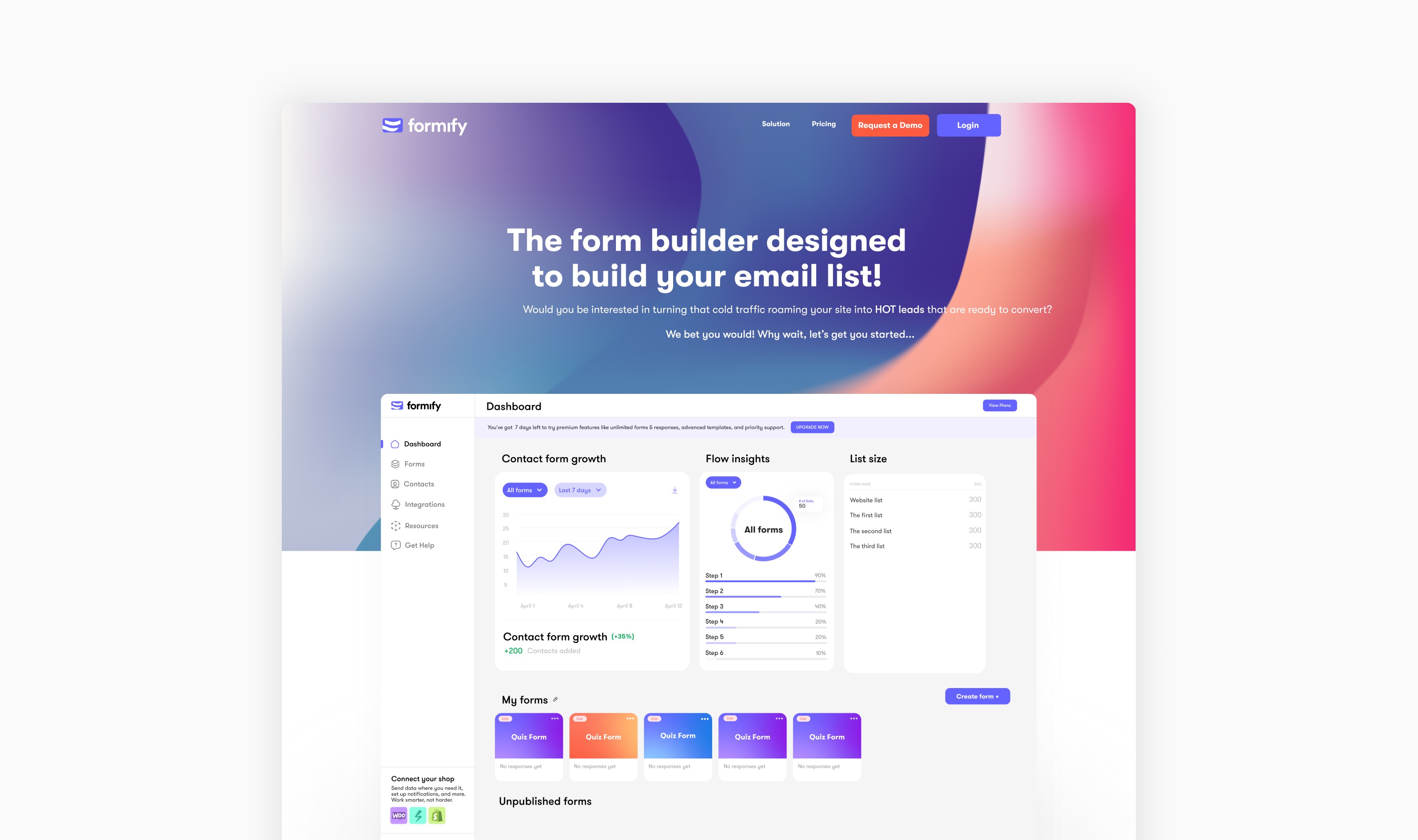
During our discussion, we addressed the importance of showcasing the right information to users. To achieve this, we need to decide what data the users actually need to see when they use the platform. We decided that displays contact form growth, flow insights, and list size as they were crucial when we asked potential users.
During our discussion, we addressed the importance of showcasing the right information to users. To achieve this, we need to decide what data the users actually need to see when they use the platform. We decided that displays contact form growth, flow insights, and list size as they were crucial when we asked potential users.
Building the dashboard
Building the dashboard
Building the dashboard
One of the key parts of interaction in Formify was going to be in the dashboard as the user would see and interact with their published forms. We discussed with the team and we argued that this would have to look modern and appealing and since the targeted audience was mainly entrepreneurs looking to improve their forms and have more insights.
One of the key parts of interaction in Formify was going to be in the dashboard as the user would see and interact with their published forms. We discussed with the team and we argued that this would have to look modern and appealing and since the targeted audience was mainly entrepreneurs looking to improve their forms and have more insights.
Through my discussions, I found common themes and requirements throughout the business. The Formify team wanted the product to look more up-to-date,Basically, design would modernize the brand, improve the current product design, and create business systems to allow for high-quality future product design.
Through my discussions, I found common themes and requirements throughout the business. The Formify team wanted the product to look more up-to-date,Basically, design would modernize the brand, improve the current product design, and create business systems to allow for high-quality future product design.
We also addressed the importance of showcasing the right information to users. To achieve this, we need to decide what data the users actually need to see when they use the platform. We decided that displays contact form growth, flow insights, and list size as they were crucial when we asked potential users. The potential users were entrepreneurs that had a business relying on forms, one of those potential users we picked for testing and interviews was BusterBox.
We also addressed the importance of showcasing the right information to users. To achieve this, we need to decide what data the users actually need to see when they use the platform. We decided that displays contact form growth, flow insights, and list size as they were crucial when we asked potential users. The potential users were entrepreneurs that had a business relying on forms, one of those potential users we picked for testing and interviews was BusterBox.
Widget functionality
To have a good form you need also a lot of widgets and there were a lot such as email, image, phone, dates etc. All of these were crucial in the form creation as users would need to have a tailor made form based on their needs.
As I was researching other form creation platforms I saw that a lot of user interaction was missing especially on the most important step of the user - the form creation.
I care a lot about my craft and I consistently seek opportunities to add dynamic interaction that elevate a product's functionality and usability.
I care a lot about my craft and I consistently seek opportunities to add dynamic interaction that elevate a product's functionality and usability.
Customizing forms
Customizing forms
Customizing forms
One of Formify's standout features is the ability to customize each form to tailor it for a specific use case. This was crucial to the product's success and a major design challenge. I was excited to work on it, as we had to find a solution that was both intuitive and easy to use.
One of Formify's standout features is the ability to customize each form to tailor it for a specific use case. This was crucial to the product's success and a major design challenge. I was excited to work on it, as we had to find a solution that was both intuitive and easy to use.
We decided to have 3 styles and pre-made templates for users, which ranged from a playful style with a rounded typeface and a youthful color palette to a more of serious tone with a serif typeface. This would help users setup a form much faster than going through the process of setting up the colors and typography.
We decided to have 3 styles and pre-made templates for users, which ranged from a playful style with a rounded typeface and a youthful color palette to a more of serious tone with a serif typeface. This would help users setup a form much faster than going through the process of setting up the colors and typography.
Formify - Quick Actions
One of the few problems me and the team ran into was that the user flow of browsing templates and connect a CRM had too many steps which could hinder user efficiency. To address this issue, I recommended the implementation of a "Quick Actions" feature that would offer easy access to the most important and crucial platform features, thereby streamlining the user experience.
One of the few problems me and the team ran into was that the user flow of browsing templates and connect a CRM had too many steps which could hinder user efficiency. To address this issue, I recommended the implementation of a "Quick Actions" feature that would offer easy access to the most important and crucial platform features, thereby streamlining the user experience.
Brand refresh
Brand refresh
Brand refresh
There was also a brand refresh that was talked before I joined as the team was not happy with how the brand kind of turned out. This would potentially help the brand's visual language and have a more clear direction on where the brand was heading in the future.
I was working with an Illustrator and very gifted animator on the team as this refresh would need to be incorporated in the new landing page that was set out to release so we sat down and discussed the design direction and inspirations.
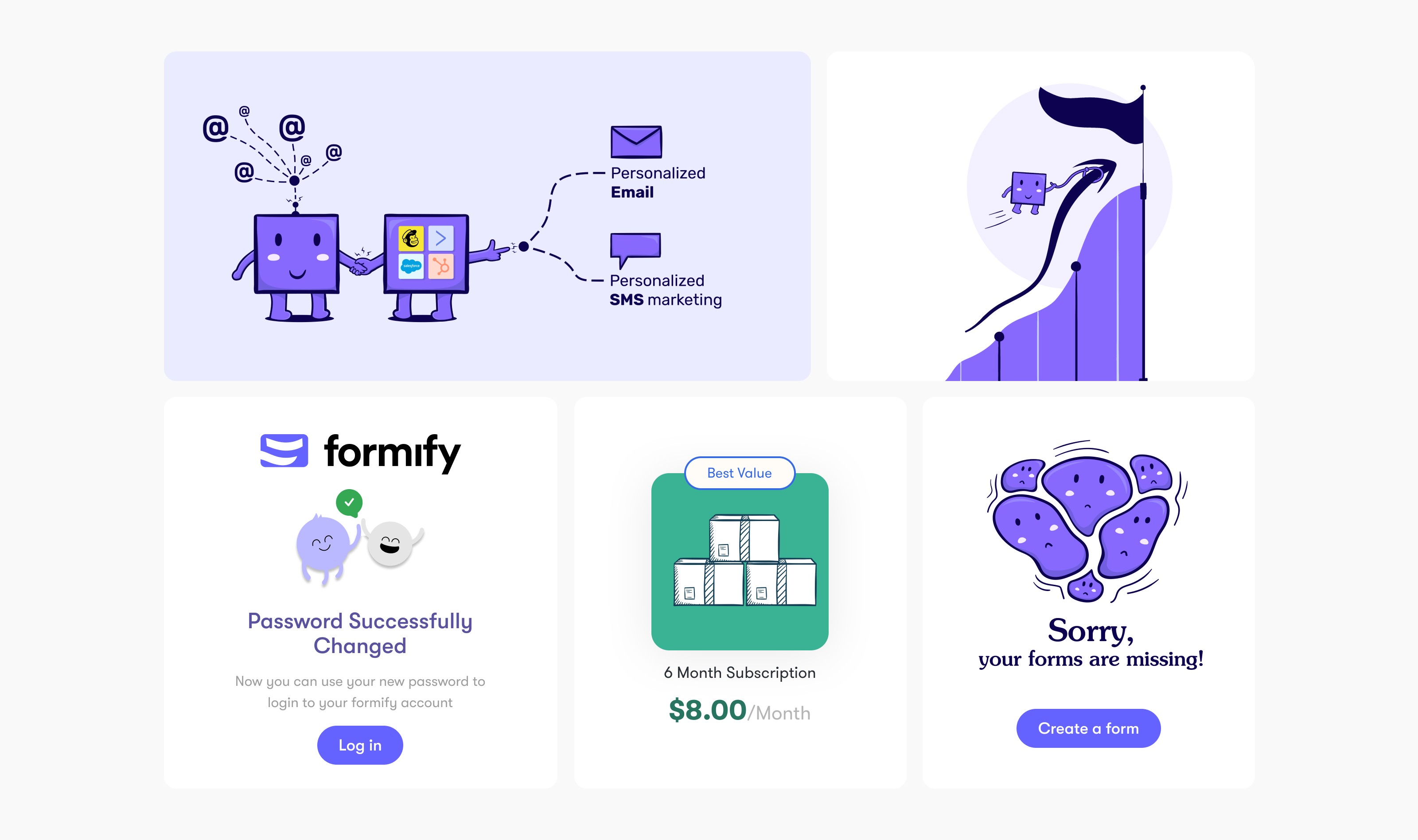
A refreshed visual language
What we came up was a more quirky, fun and energized visual direction. We also came up with a mascot that had no name (yet) for Formify which was very neat and there was a lot of potential and a good base to build on in the future.
I decided to incorporate this mascot and some of the visual assets onto the final product, I also included the mascot into some of the user flows such as changing the password, error states etc.